Your panel, as a phone app.From this code.
Filament pages are made for a desk. Warp Mobile adds a bottom tab bar, turns table rows into cards you can swipe and slides modals up as bottom sheets, only on narrow screens.
FilamentWarpMobilePlugin::make() ->tabs([ MobileTab::make('home') ->page(Home::class), MobileTab::make('deliveries') ->resource(DeliveryResource::class), ])$table ->mobileCards() ->swipeActions( leading: 'delivered', trailing: ['edit'], )- ✓A bottom tab bar from your navigation, with badges
- ✓Table rows become cards with swipe actions
- ✓Wider screens do not change at all
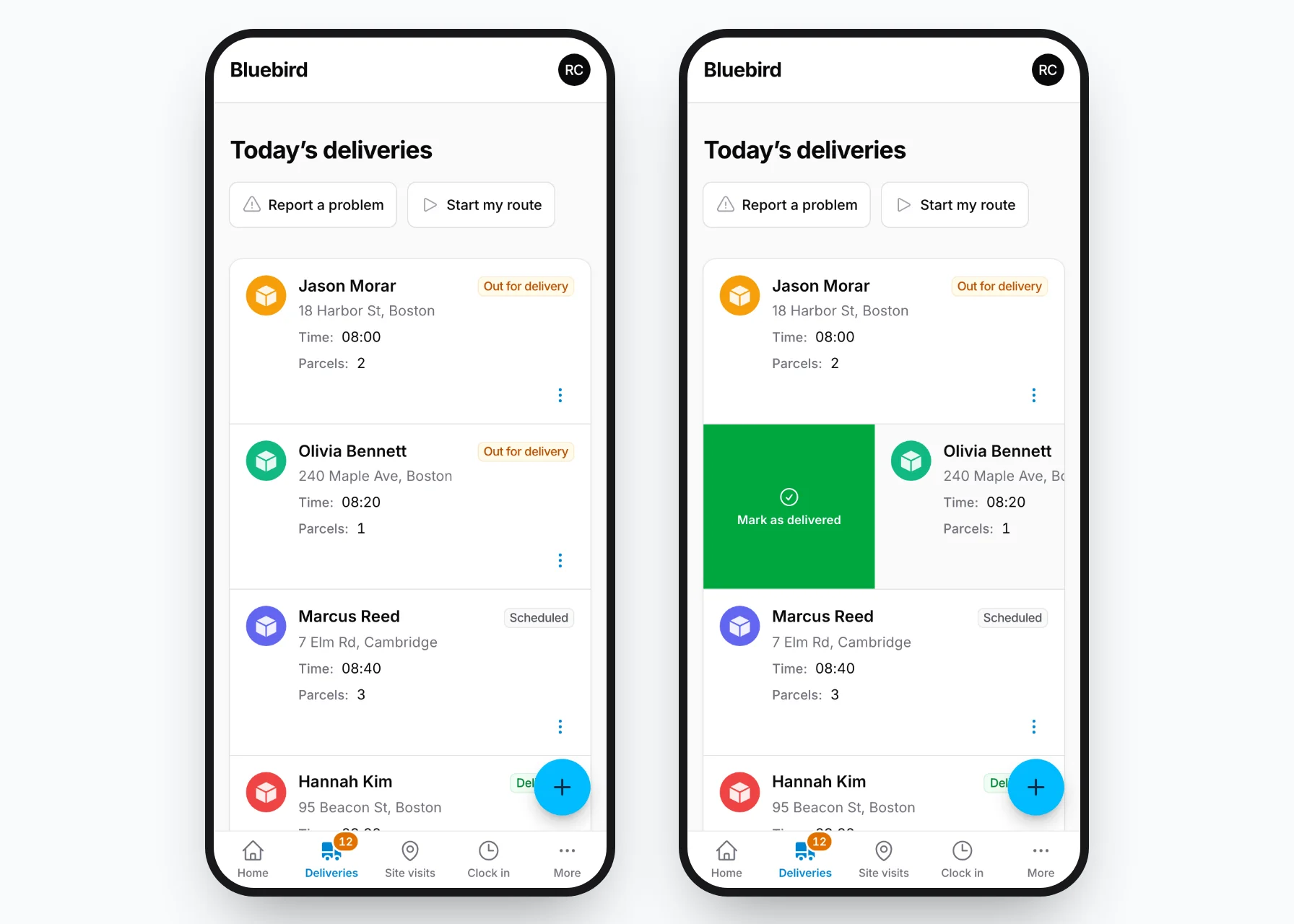
The picture is this demo's phone app: the Deliveries list with a card swiped to the right.
Warp Mobile makes a Filament panel feel like an app on a phone: tabs at the bottom, a back button, cards instead of wide tables, swipe actions, pull to refresh and sheets from the bottom. On a wide screen the panel stays as it is.
How to use the phone on the right
- It is a real Filament panel (the address ends in /app) with Warp Mobile on. The frame is 390 px wide, the width of a phone, so the panel shows its phone layout.
- Click where you would tap. To swipe a card, pull down a list or drag a sheet closed, press the mouse button, drag and let go. The demo turns on
->mouseGestures()so that the mouse works like a finger. - Each page on the left shows one feature. Follow its steps in the phone; “Show this in the phone” opens the right page there.
What to try
-
1
Bottom tab bar
The main pages as tabs at the bottom, within reach of your thumb.
-
2
Back button
A “Back” button at the top for pages that are not tabs.
-
3
Card lists
Tables become cards on a phone, with the important columns first.
-
4
Swipe actions
Swipe a card to see its buttons, or swipe all the way to run one.
-
5
Pull to refresh
Pull a page down to load what other people changed.
-
6
Bottom sheets
Modals open from the bottom, close with a drag down.
-
7
Floating button & tap targets
The main button at your thumb, and buttons big enough for a finger.
Try it on your phone
Scan the code with your phone’s camera, or open this address. On a real phone, your finger does the swiping and pulling.
Reset the demo data
Everyone who visits shares the same deliveries, site visits and clock entries. This button puts them back as they were (it also happens every hour by itself).
Click to tap. To swipe or pull, press the mouse button and drag — the mouse works like a finger here.
You are on a phone
The phone frame is for computers. On your phone, open the app itself and follow the steps with your finger.
Open the app